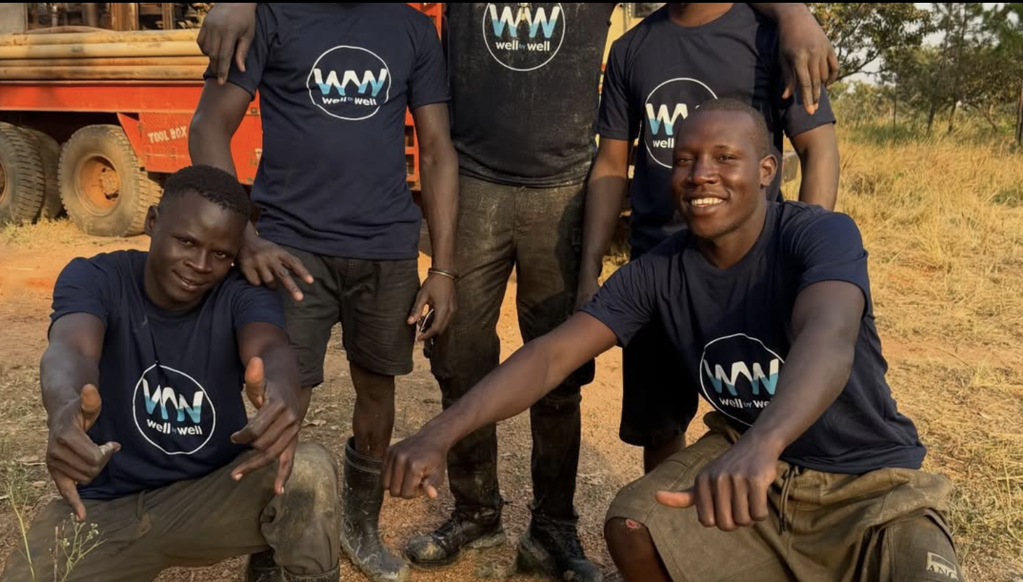
A Ugandan man named Chris Tito left home many years ago and returned in 2020 only to see people in his community were still walking up to two miles to fetch clean water. He said the next time he came back, it would be to build a clean water well.
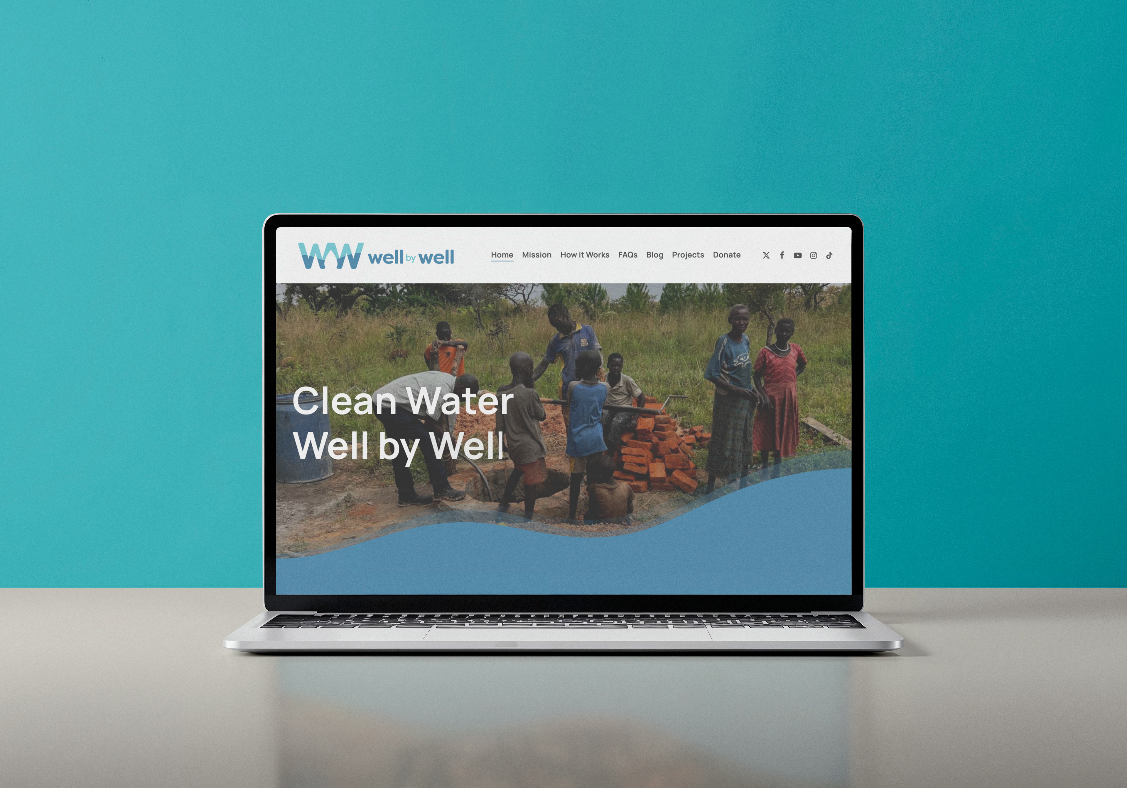
Well by Well is reducing the scarcity of clean water in Northern Uganda, improving their communities' health, opportunity and well-being.
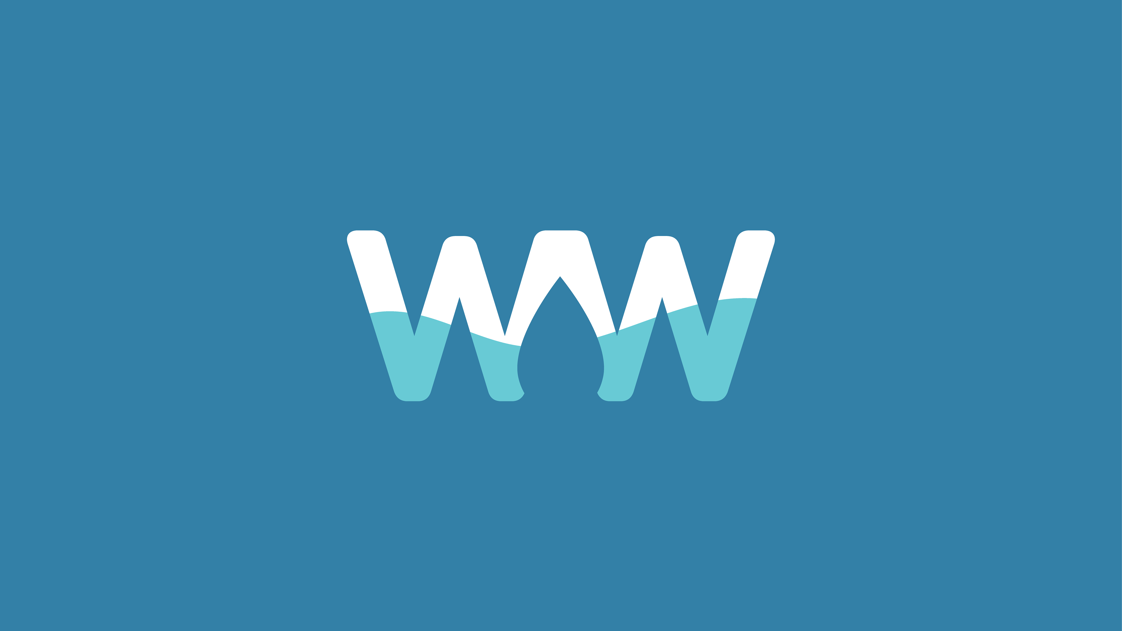
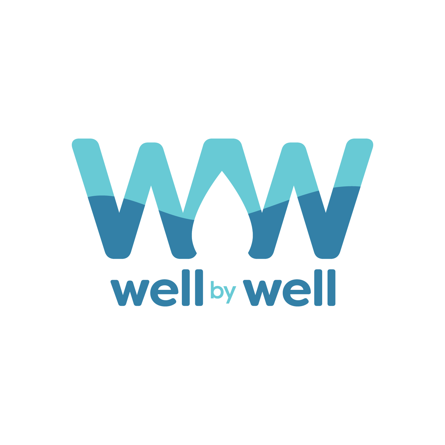
The brief was to develop a simple logo and ultimately brand identity that intertwined the essence of the company within the two letters of their name. Well by Well can be interpreted in two ways – both words representing physical wells, or the first representing wellness.
It was important for the palette to represent a sense of approachability, positivity, trust, and of course – water. Closure conveys the drop in between the two letters while the duotone within alludes to water movement.
In a few short years, they have drilled and built clean water wells for the Goma, Lukome, and Laboye villages – and that's just the beginning.