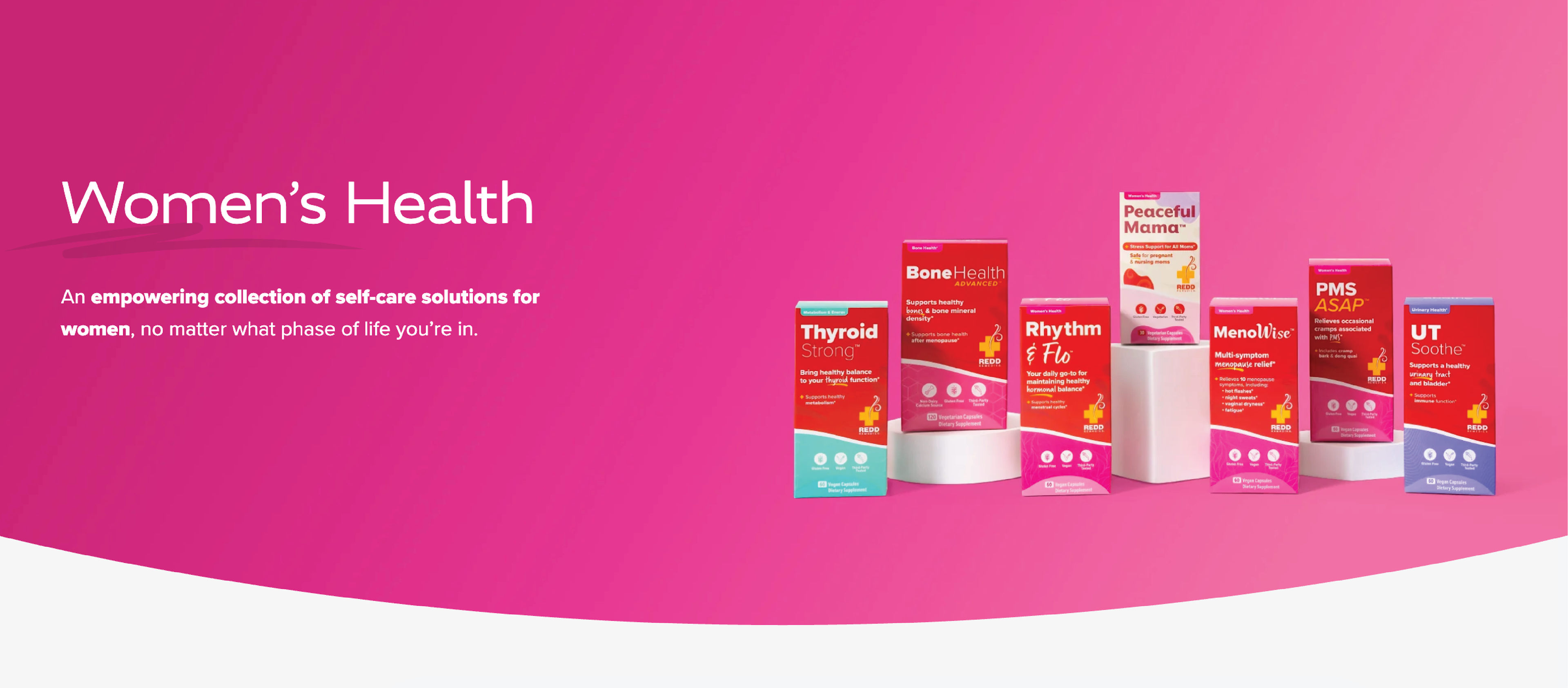
Redd Remedies has been providing natural supplement solutions with eastern medicine ingredients for even the most challenging of ailments for 20+ years. The brand needed to catch up to a modern audience, and their upcoming women's line launch was a strategic opportunity.
They needed a new website, packaging design, updated photography and assets to establish a design language that appealed to a very competitive wellness market.
Redd is unique in the sense of their extremely rigorous testing process of their ingredients from all over the world. The launch of one of these women's products was delayed close to a year due to one of the ingredients not quite being up to their standards.
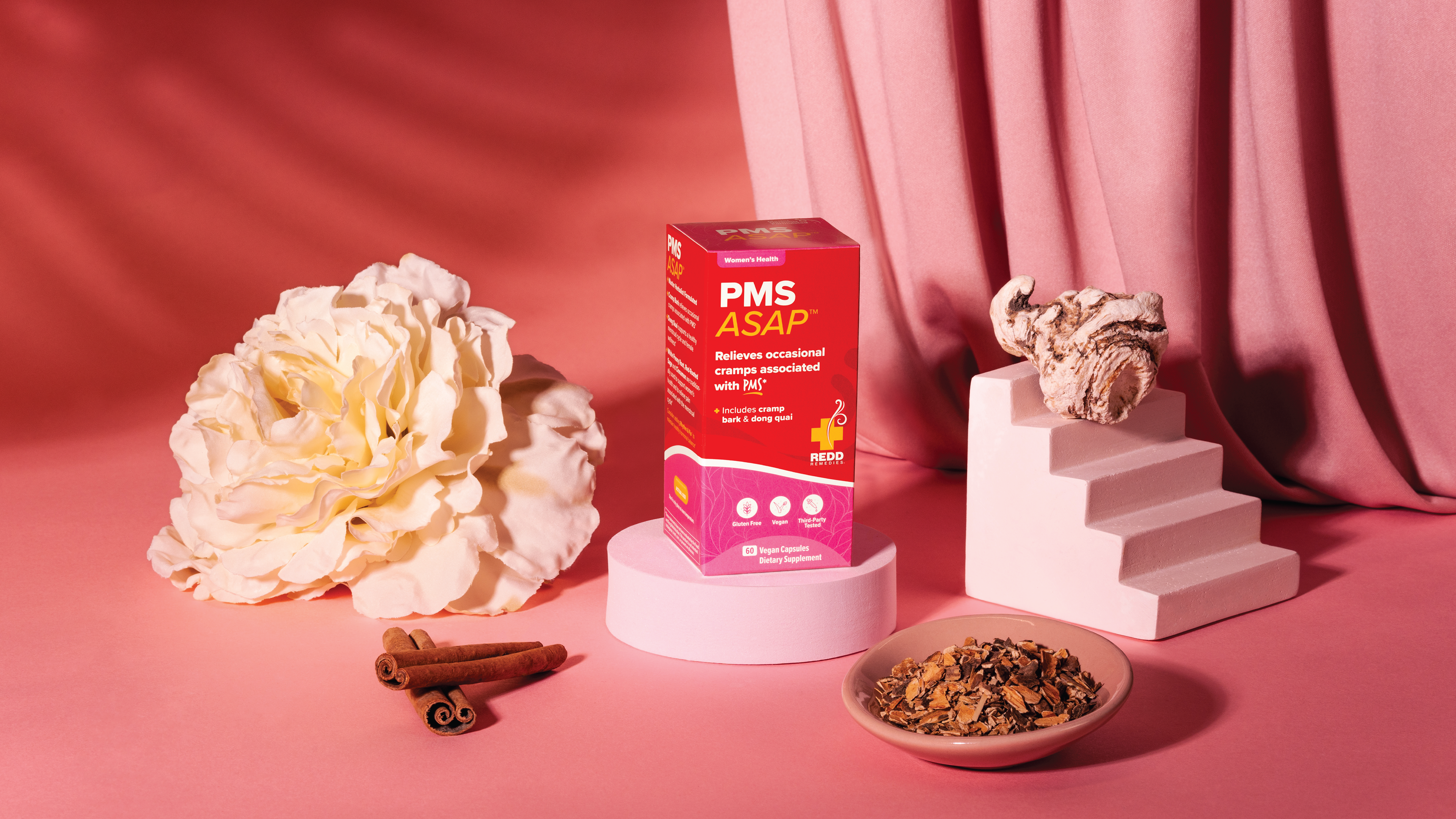
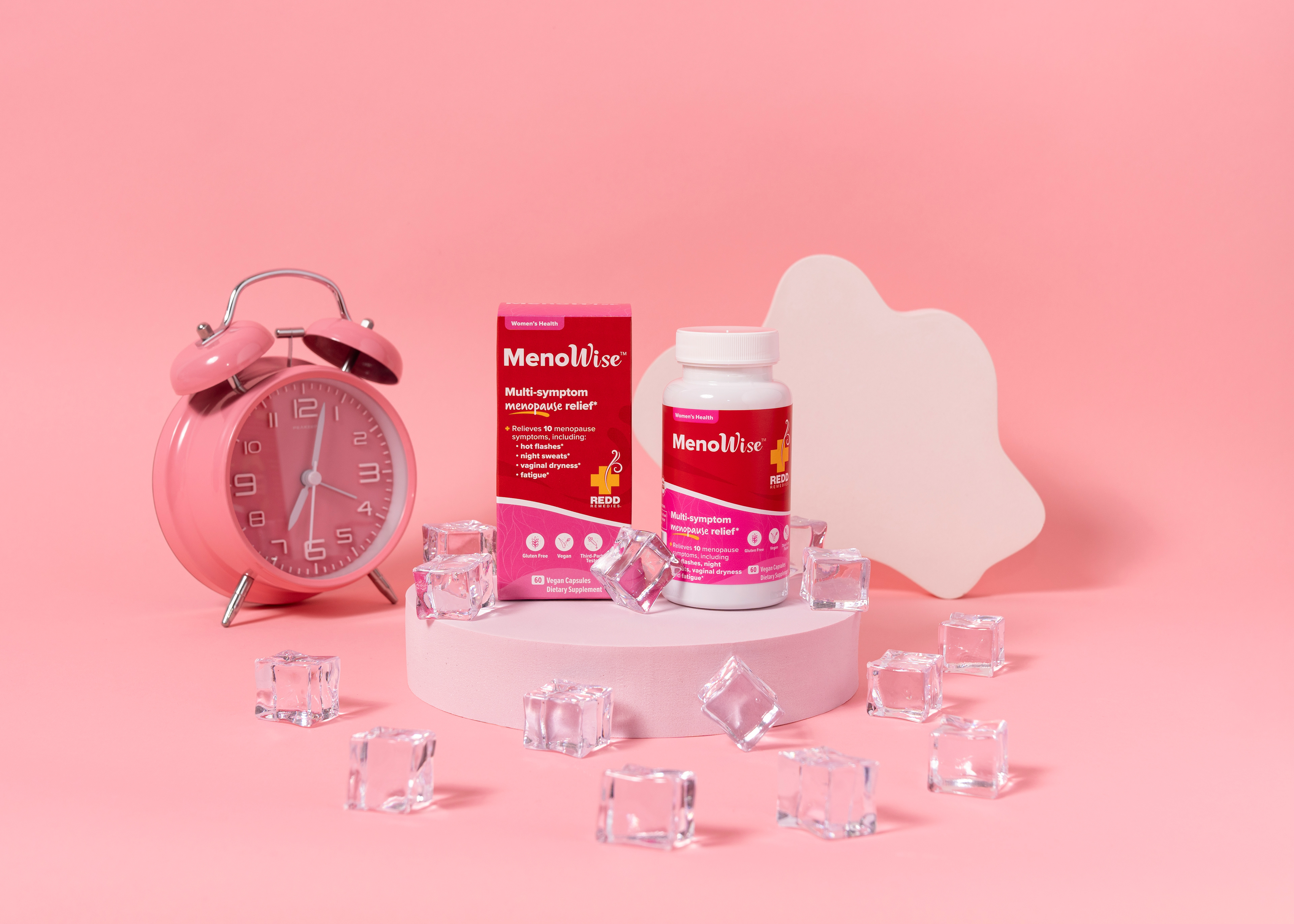
The packaging needed to have the same foundation as the rest of their 50+ SKUs as to not lose brand familiarity, but with a renovated look. This line offered an opportunity to play with sophisticated, feminine colors, highlighting natural ingredients used in the formula.
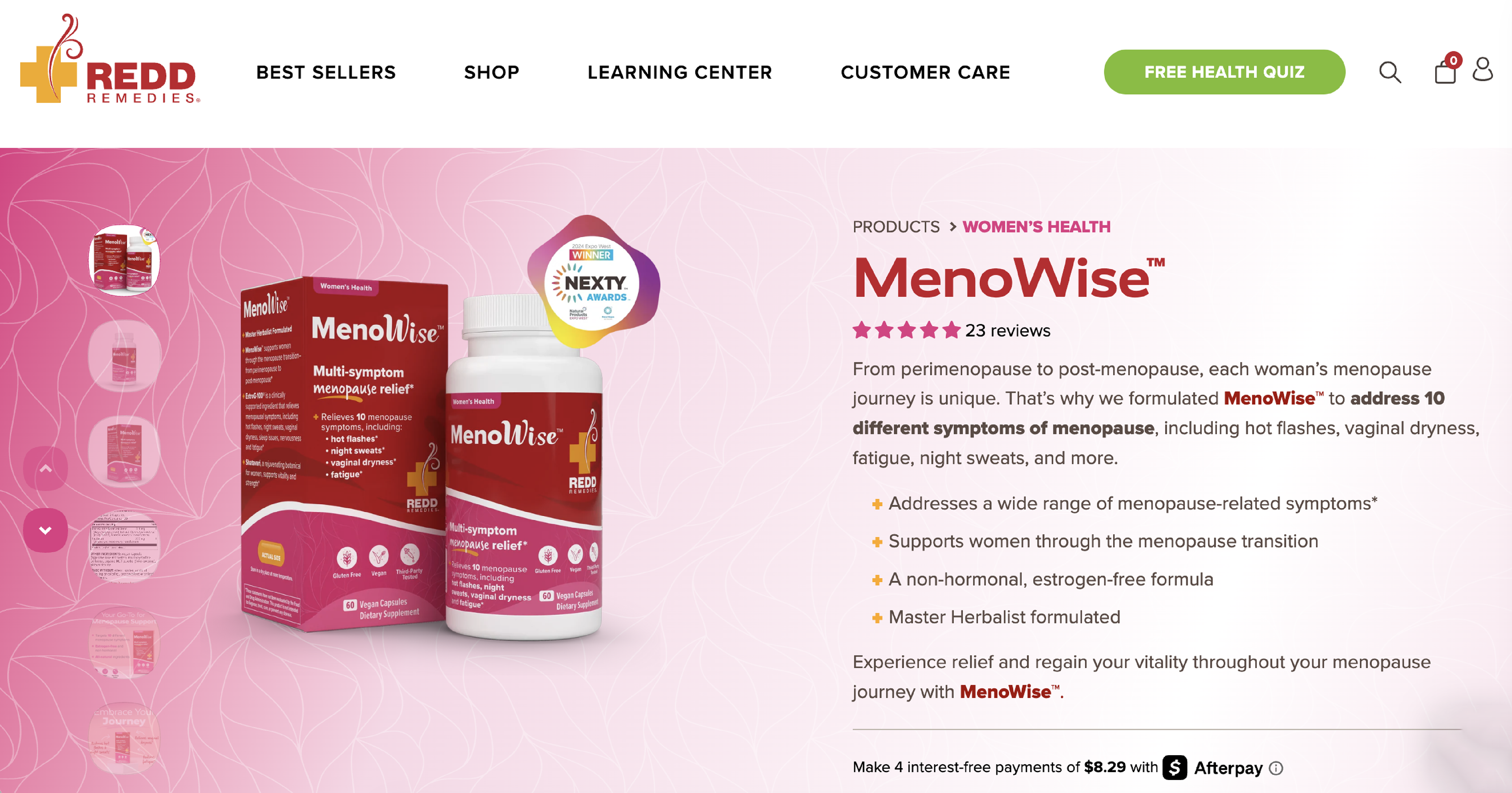
Similar to their women's line, every Redd Remedies product page highlights what ingredients are used and why, with the option to learn more about each one.
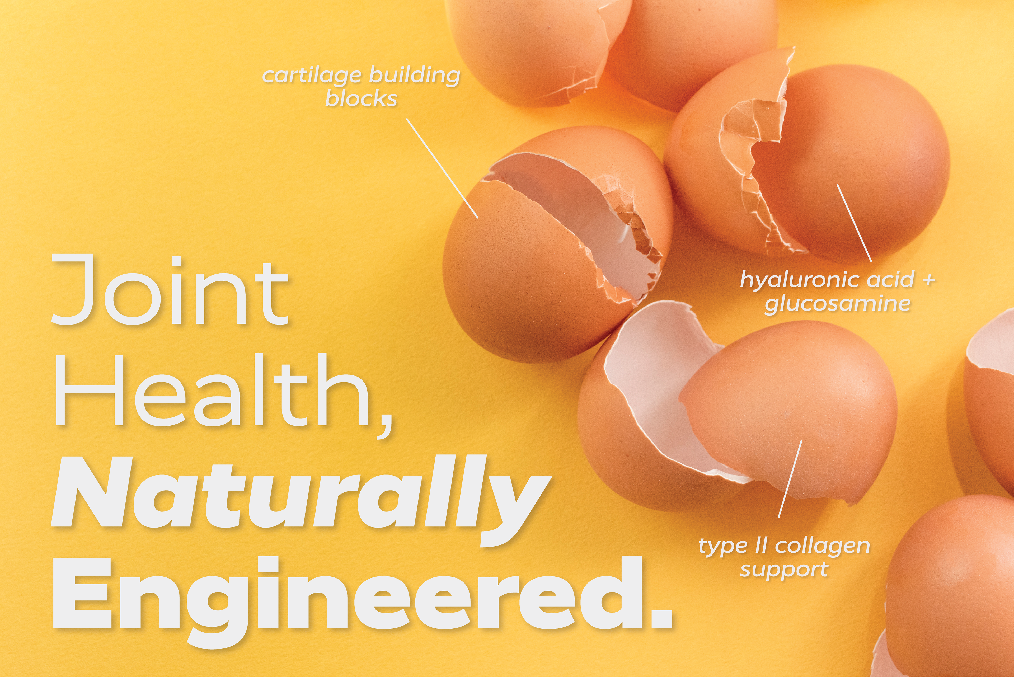
Egg shell membranes are one of the most powerful elements in their joint health formulas. Macro photography of ingredients such as this were used throughout their assets and marketing material to let audiences see something that is ordinarily thrown away, in an entire new light.