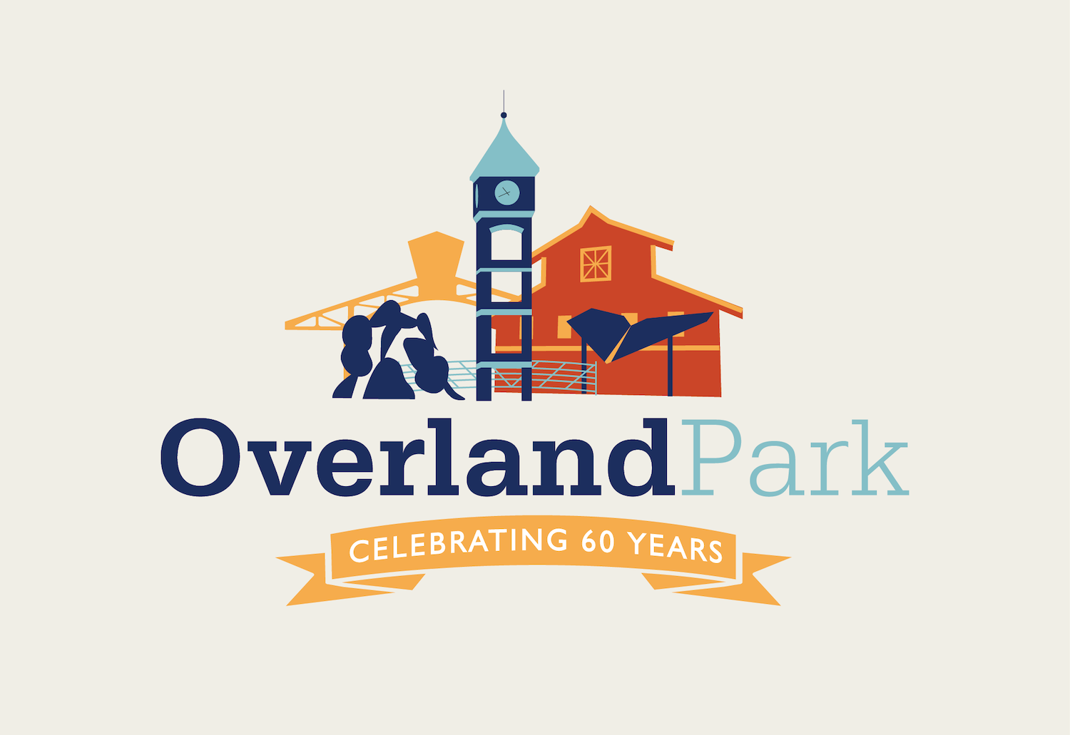
The city of Overland Park, Kansas needed a campaign of graphics for their 60th anniversary. These would be featured across all marketing materials, street flags, city vehicle wraps, and social.
The brand identity specifically created for the anniversary would be used for one full year at all social city events, farmers markets, fundraisers, and celebrations.
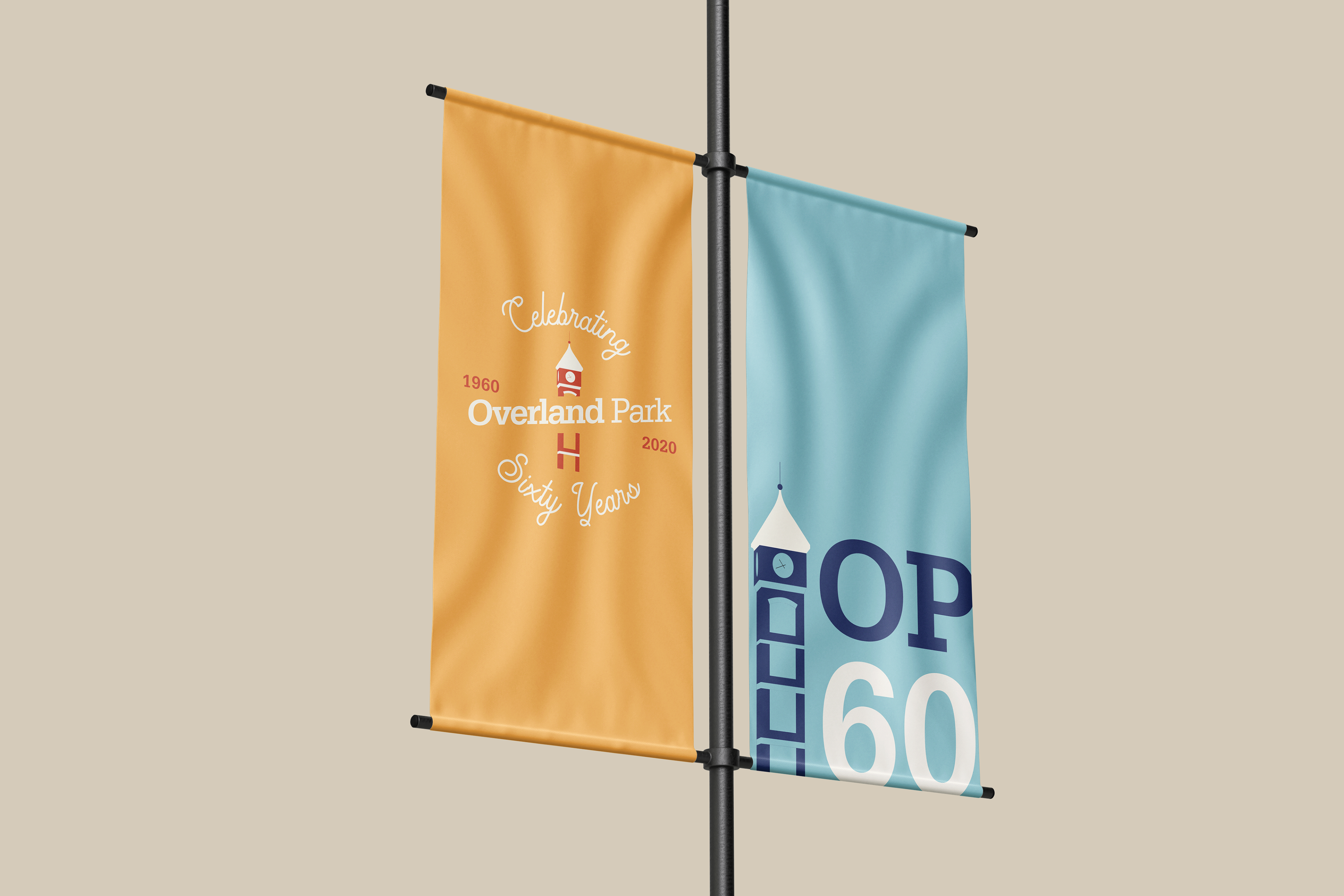
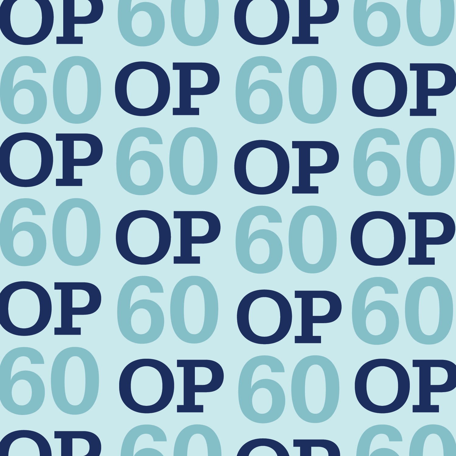
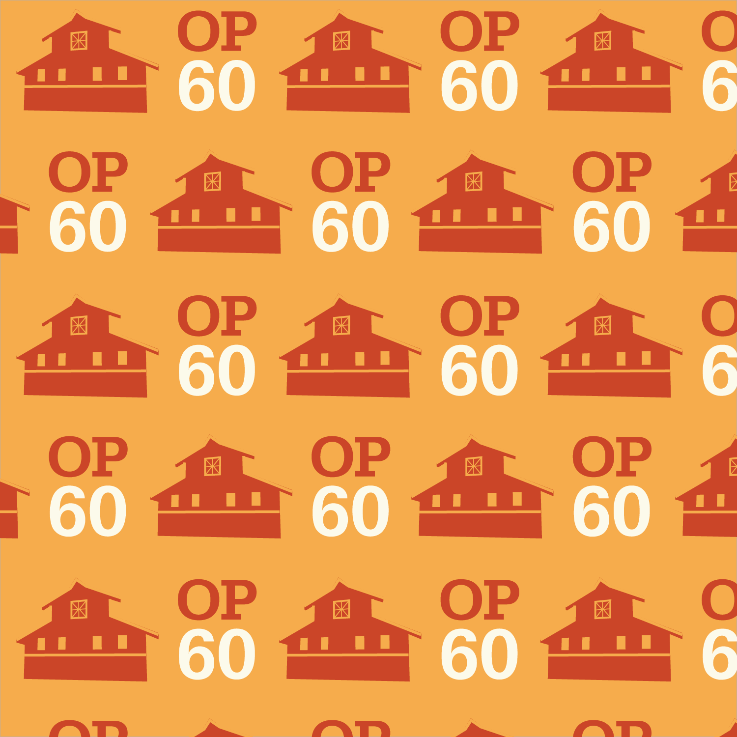
Complimentary hues of blue and yellow established a clean and classic aesthetic with a nod of retro. Secondary colors in each pallet were used for a monotone look when used in isolation.
The script font accented the vintage feel, paired with a serif typeface for bold legibility.
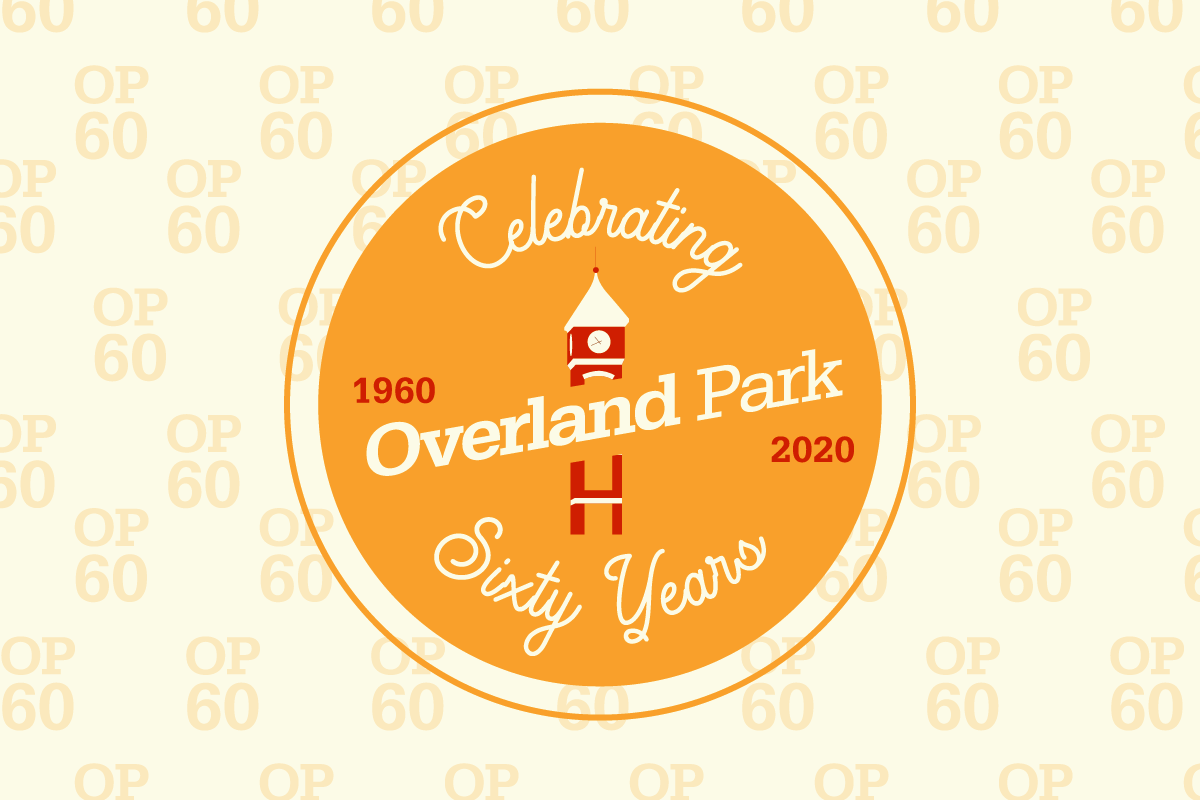
Iconic landmarks of their small downtown district were designed as silhouetted icons to create a micro skyline. Each element uses only two tones for simplicity to stay within a limited brand identity, and is informed by the contrast and colors around it.